
2: Arsenal, Merlin’s Premier League 95 Sticker Collection
Today Richard Allinson goes, quite literally, to the heart of the matter with a look at arguably football clubs’ most recognisable feature. All the important points Rich raises were clearly not up for consideration when Puma unleashed their reprehensible range of third kits on the world although perhaps when such concerns were raised the cool kids behind the designs just decided to talk over them. Over to Rich.
Recently, my beloved Grimsby Town decided to change their club badge. The new one was apparently “… constructed wholly upon a grid of geometric shapes that are compositionally harmonious in their relation to each other, and the scale of components such as line weight and negative space have been optimised to allow the crest to be used at any scale – digitally and physically.” Fancy words, but in all honesty, it would be of much more interest to me if our players were harmonious in their relation to each other.
Football clubs getting a new badge is something that has always been beyond me. Let’s face it, it is the same as calling a Mini Metro a Rover Metro. It is the same car, they’ve just rebadged it, you fool. In my view, the fabric of a club is wrapped up in its traditions and values, and club crests are a part of this. In the case of Grimsby’s new badge, the alterations are so minor they are barely noticeable. Yes, the new version might look a bit overcrowded, but it is still recognisable as the Mariners’ badge so it isn’t that much of an issue. If I was a fan of some other clubs though, I would really be left scratching my head.
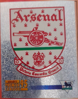
Take Arsenal for example. Their current badge really looks like it should belong to North London Reds and represent their battle for the Konami Cup every year. Which in fairness, is probably a more realistic shout for silverware than any chance they have in the real world. The various iterations of their VCC crest used between 1949 - 2001 were things of beauty. Their post 2002 offering looks like it was done as part of a GCSE Art project, and one that got a grade D at that. It is just so bloody boring.
As bad as Arsenal’s badge is, at least they’re not Leeds United. Leeds’ club crest has always baffled me because for such a great club with the history that they have, they’ve chopped and changed their badge about as often as they changed their manager when that old Italian fella was chairman. Thirteen badges in 62 years apparently, including tweaks on existing versions. In my opinion, their best offering was the one they based their 1984-1998 crests on, although this does coincide with when my interest in football was at its peak, so I’m probably biased. However, any discussion on football badges can’t be complete without the absolute horror show that they tried to sneak through in 2018. You know the one, it looked like a questionable protest group’s symbol, whilst being so ashamed of itself the man in the badge was actually covering the crest up. It was absolutely terrible and thankfully got shelved.
Another one that confuses me is Halifax Town. Their current badge has five stars emblazoned across it. The last time I checked, neither the current club or its predecessor have won the European Cup, FA Cup or Premier League five times, so why are the stars there? I would genuinely like to understand the reasoning because from an outsider's perspective it makes no sense. Maybe it is the TripAdvisor rating the catering at The Shay gets? Maybe it was the only bit of Clip Art that fitted in the gap? Who knows. Next up is Crystal Palace, another club not averse to getting the crayons out. They’ve had three badges in the last 35 years, all of which have basically been “eagle on ball, on glass palace”, which makes you wonder if it was really worth the effort.
When I was researching this piece the word “rebranding” came up a lot. I think this is the essence of my issue with the changing of a club crest, especially when it is a complete change like Arsenal or the “look at this well good new font I’ve just found on Word” effort that Juventus now have. These are football clubs that represent their community, not a brand relaunch for some sweets (#TeamOpalFruits). I’m aware a lot of people may disagree with this whole article and maybe I put too much weight on something that has little to no effect on how a team plays. However, although these new badges might be geometrically aligned with themselves, if they’re not aligned with the towns and fans they’re meant to represent, then what is the point?


Comments
Post a Comment